



Most jewelers don't have a KPI problem. They have a fragmentation problem.
Why most jewelry dashboards fall apart the moment the shop gets busy
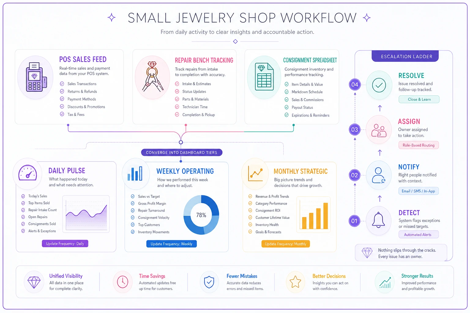
Walk into any two-location shop and you'll usually find three different sources of truth sitting on three different screens. The POS knows what sold. The repair log — sometimes a real system, sometimes a spiral notebook by the bench — knows what's in the pipeline. And consignment lives somewhere else entirely, often in a spreadsheet that only one person actually understands. Each of these tells a slice of the story. None of them talk to each other.
The result is a shop that feels profitable but can't answer basic questions quickly. How much of last month's revenue was actually margin versus pass-through consignment payouts? How many repairs are sitting past their promised date right now? Is the bench a bottleneck, or is the front counter just over-promising? When the answer to each of these lives in a separate place, nobody looks until something breaks.
A proper jewelry KPI dashboard isn't about tracking more numbers. It's about deciding which numbers matter, who looks at them, how often, and — the part almost everyone skips — what happens when a number crosses a line. That last piece, escalation, is what separates a dashboard people glance at from one that actually runs the shop.
The three data streams that never agree
Before you can merge anything, it helps to be honest about why POS, repair, and consignment metrics resist living together.
Never miss a sale or shipment again.
Jewlyly helps you manage orders, track inventory, and engage customers seamlessly.
- Real-time inventory tracking
- Automated customer notifications
- Sales and order analytics
No credit card required
POS data is clean and immediate. A sale happens, it's recorded, the numbers are trustworthy. This is why most owners over-index on POS reporting — it's the easiest data to trust, so it gets all the attention.
Repair data is time-based, and time-based data ages badly. A repair opened today is fine. The same repair, unchanged, becomes a liability in three weeks. Your POS won't flag it, because from the register's perspective nothing happened. That's exactly the kind of silent aging that creates counter disputes — which is why there's a whole separate playbook on stopping repair bottlenecks and disputes. A dashboard that only shows repair counts misses the point. You need repair age.
Consignment data is the messiest of the three because it mixes ownership. That $4,800 estate piece on the floor isn't yours. If it sells, most of the money leaves. If you report consignment sales as revenue without separating the payout, your top line looks great and your actual take-home is a fraction of it. This is where owners fool themselves the most — a strong sales month that quietly netted very little.
A tiered dashboard exists precisely because these three streams operate on different clocks and different logic. You can't blend them into one flat report. You have to tier them.
What "tiered" actually means in practice
Tiering means the dashboard has layers, and each layer is meant for a different person, at a different frequency, with a different level of detail.
| Tier | Who looks | How often | What it shows | Detail level |
|---|---|---|---|---|
| Tier 1 — Pulse | Owner / manager | Daily (2 min) | Sales vs target, overdue repairs, cash issues, any red flag | Just the exceptions |
| Tier 2 — Operating | Manager + leads | Weekly review | Margin, repair throughput, consignment net, conversion | Full metric set |
| Tier 3 — Strategic | Owner | Monthly | Category mix, consignment aging, vendor performance, trend lines | Deep, with context |
The mistake most people make is building one giant Tier 2 report and trying to use it for everything. It's too much to check daily, so nobody does, and it's too shallow for real monthly planning. You end up with something that's simultaneously overwhelming and insufficient.
The daily Pulse tier should fit on a phone screen. It's not a report — it's a smoke detector. Green means don't think about it. The weekly Operating tier is where actual decisions happen. The monthly Strategic tier is where you catch slow drifts that no single week would reveal.
The metrics worth putting on each tier
Not every number deserves a spot. A KPI earns its place only if a specific decision changes when it moves. If nothing changes when a number shifts, it's a vanity metric cluttering the view.
Tier 1 (daily pulse) — exceptions only:
-
Repairs past promised date (count)
-
Repairs promised in the next 48 hours (count)
-
Yesterday's sales vs daily target
-
Any consignment item sold but not yet reconciled
-
Register/till variance flag
Tier 2 (weekly operating) — the working set:
-
Gross margin % (POS, excluding consignment pass-through)
-
Repair throughput
opened vs closed this week
-
Average repair turnaround, in days
-
Consignment net (sales minus payouts) as its own line
-
Sell-through on new inventory brought in over the last 90 days
-
Appointment or high-ticket conversion rate
Tier 3 (monthly strategic) — the slow signals:
-
Consignment aging buckets (0–30, 31–60, 61–90, 90+ days)
-
Category-level margin trend over 6 months
-
Repeat-repair rate (same item back within 60 days — a quality signal)
-
Dead stock aging
-
Revenue mix
owned goods vs custom vs repair vs consignment
Notice how repair shows up on all three tiers but differently each time. Daily, you only care about what's overdue. Weekly, you care about flow. Monthly, you care about quality. Same underlying data, three different lenses.
One thing worth calling out: none of these numbers are trustworthy if your product data is a mess. If two staff members enter the same ring type three different ways, your category margins are fiction. A clean SKU schema is the quiet foundation the whole dashboard sits on. Garbage in, confident-looking garbage out.
Thresholds: turning numbers into lines you can't ignore
A number without a threshold is just trivia. "Average repair turnaround is 11 days" means nothing until you decide whether 11 is fine or a fire.
Every Tier 1 and Tier 2 metric should have three zones: green (fine), yellow (watch it), red (act now). The trick is setting these based on your shop's reality, not some generic benchmark. A shop that promises two-week turnarounds has completely different thresholds than one promising same-week service.
-
Overdue repairs green 0–1, yellow 2–4, red 5+
-
Repair turnaround green under promised SLA, yellow at SLA, red past SLA
-
Weekly margin green above target, yellow within 3 points below, red more than 3 points below
-
Consignment aging 90+ green under 5% of consignment value, yellow 5–12%, red over 12%
-
Till variance green under $20, yellow $20–75, red over $75
Set these once, then tighten them as the shop improves. Thresholds should get stricter over time. If you never hit red anymore, your green zone is probably too generous and you're leaving performance on the table.
Escalation: the part everyone forgets
A red number has to do something. If crossing a threshold just produces a red cell that everyone glances past, the whole system quietly dies within a month.
Escalation means a defined answer to: when this goes red, who's told, how fast, and what's the required response?
-
Yellow triggered → noted in the weekly review, owner of that metric gives a one-line reason. No action required, just awareness.
-
Red triggered, first occurrence → the responsible person (bench lead, floor manager) is notified same day and has 48 hours to either fix it or explain the plan.
-
Red persists into the next review → escalates to the owner and becomes a standing agenda item until it clears.
-
Red twice in a rolling month → treated as a system problem, not a one-off. That means changing a process, not just working harder for a week.
The escalation ladder does something psychological that's easy to underestimate: it assigns ownership. Every metric needs a name attached to it. "Overdue repairs" isn't the dashboard's problem — it's the bench lead's problem, and everyone knows it. Numbers without owners get admired and ignored in equal measure.
The weekly review cadence that makes it stick
The dashboard only earns its keep if there's a fixed rhythm around it. "We'll check when we can" always loses to whatever's on fire that day.
-
Scan Tier 1 — any reds carried over from the daily pulse? Start there.
-
Walk Tier 2 top to bottom — each metric owner reports green/yellow/red in one sentence. No storytelling.
-
Handle escalations — anything red gets a decision and an owner before the meeting ends. Not "let's think about it." A decision.
-
One improvement — pick a single yellow that's drifting toward red and agree on one change to test this week.
-
Close — confirm who owns what before next review.
The discipline is in the boredom. Same order, same time, every week. Shops that actually make dashboards work tend to have one thing in common — the cadence matters more than the sophistication of the metrics. A mediocre dashboard reviewed religiously beats a beautiful one reviewed occasionally, every time.
Keep a short running log of escalations and how they resolved. Over a few months this becomes the most valuable document in the shop — it shows your recurring failure points, which is where real process fixes live.
A real scenario: two-location shop, hidden consignment drag
A family-run jeweler with two locations and a three-person bench was running around $95k–$110k in monthly sales and feeling good about it. Repairs were "handled." Consignment was "doing fine."
When they built a tiered dashboard, two things surfaced quickly.
First, consignment. Reported sales looked strong, but once payouts were pulled into their own line, consignment was netting the shop only about 18% of its reported consignment revenue. And worse, nearly a quarter of consignment inventory value was sitting in the 90+ day aging bucket — tying up floor space and staff attention for pieces that weren't moving.
Second, repairs. The daily overdue count was routinely sitting at 6–8 items, well into red, but because it was spread across two locations nobody had ever seen the combined number. Each location thought it had "a couple" behind. Together it was a chronic problem.
Escalation rules forced both issues into the open. Overdue repairs got a named owner at each location and a 48-hour rule. Aged consignment got a hard conversation with consignors and a return-or-discount decision. Over roughly two months, overdue repairs settled into the 1–2 range on a normal day, and clearing dead consignment freed up display space for owned inventory that actually carried margin. Total sales didn't spike dramatically — but the net improved noticeably, which is the number that actually pays the bills.
Nothing here required new software magic. It required seeing the combined picture and attaching consequences to red numbers.
When a tiered dashboard makes sense — and when it doesn't
When it makes sense:
-
You run more than one revenue stream (repair, consignment, custom, owned goods) and they blur together in reporting.
-
You have two or more locations, or a bench separate from the sales floor, where nobody sees the combined view.
-
You're at the size where the owner can no longer eyeball everything personally.
When it's overkill:
-
A single owner-operator doing mostly walk-in sales with light repair. You already carry the whole picture in your head, and a three-tier system is ceremony you don't need. A simple weekly check of five numbers is plenty.
Who should NOT do this yet:
Any shop whose underlying data is unreliable. If your inventory categories, repair statuses, or consignment records are inconsistent, fix the data hygiene first. A dashboard built on bad inputs just gives you confident wrong answers — which is worse than no dashboard at all.
Building your own: where to actually start
You don't need a fancy tool to begin. A spreadsheet with three tabs — Daily Pulse, Weekly Operating, Monthly Strategic — plus a fourth tab for the escalation log will take a shop surprisingly far. Color-code the thresholds with conditional formatting so red actually turns red on its own. Start there for a month before you consider anything more automated.
Color-code the thresholds with conditional formatting so red actually turns red on its own.
Where spreadsheets start to strain is the pulling. Every week someone has to export POS numbers, count overdue repairs by hand, calculate consignment net, and drop it all into the tabs. That manual assembly is manageable at one location. Across two or three, or once the metric set grows, it quietly becomes an hour or two of someone's week — and the week it gets skipped is usually the week something was going red.
Operational platforms that connect POS, repair tracking, and consignment records can keep the tiers populated automatically and flag thresholds the moment they trip. That mostly matters because it removes the excuse to skip a review. But it's a convenience, not a prerequisite. The thinking — the tiers, the thresholds, the escalation ladder — is the actual work, and you can do all of it by hand today.
The shops that get real value out of a jewelry KPI dashboard aren't the ones with the prettiest charts. They're the ones who decided, in advance, what a red number means and who has to answer for it. Get that right, keep the weekly rhythm boring and consistent, and the dashboard stops being a report you look at and becomes the thing that quietly keeps the whole operation honest.
Ready to elevate your jewelry store operations?
Join 500+ jewelers using Jewlyly to increase efficiency, reduce errors, and grow revenue.